

 By
By As fashion evolves, each season brings men’s new colour trends to experiment with. Knowing how to incorporate seasonal shades while avoiding common colour-matching mistakes is essential for staying stylish and on-trend.
Here’s a guide to this year’s top seasonal colour combinations for men and a few tips on what to avoid when matching colours.
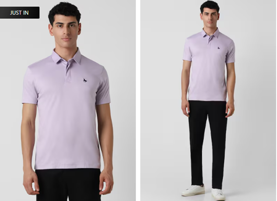
Spring: Pastels and Neutrals
Spring is all about fresh, light colours that reflect nature’s renewal. Pastel shades like lavender, mint green, and sky blue are popular. Pair a pastel-coloured shirt with neutral beige or light grey trousers for men for a soft and refreshing look. This combination is perfect for outdoor brunches or casual office days.
Summer: Bright’s and Whites
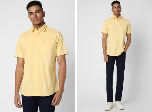
Summer is the time to experiment with bold, bright colours. Shades like coral, turquoise, and yellow dominate the season. Pair these bold tones with crisp whites for a lively summer vibe. A coral shirt with white shorts or a bright-coloured men’s polo paired with white chinos offers a stylish, breezy outfit for the hotter months.
Autumn: Earth Tones and Muted Shades
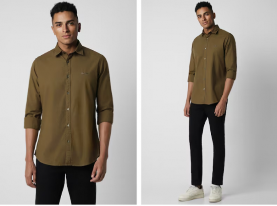
As the leaves change, so should your colour palette. Earthy tones like rust, olive green, and burnt orange become autumn’s standout shades. Pairing these hues with darker neutrals like brown or charcoal creates a grounded, seasonal look. An olive-green jacket for men over a burnt orange sweater provides the perfect fall fashion ensemble.
Winter: Dark and Bold
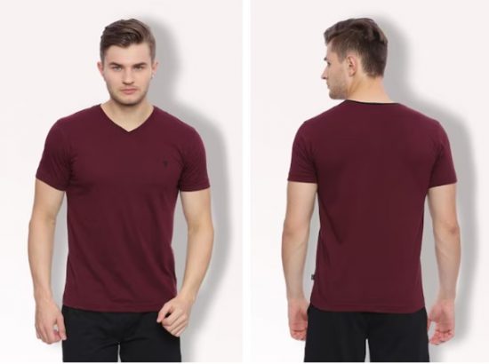
Deep, rich colours like navy, burgundy, and charcoal dominate winter fashion. When paired with bold accessories, these shades provide a polished, sophisticated look. A navy jacket with black trousers or a burgundy coat over a men’s sweater are excellent winter combinations that keep you looking sharp and stylish in colder weather.
Mistakes to Avoid When Matching Colours
While experimenting with colours can enhance your style, there are a few common mistakes to avoid:
Overdoing Bright Colours – Bold colours can make a statement, but wearing too many bright hues at once can be overwhelming. Please balance one or two bright colours with neutral tones for a more refined look.
Ignoring Neutrals – Neutrals like black, white, grey, and beige are essential in balancing your outfit. A well-balanced look often includes a mix of bold and neutral tones, allowing your more colourful pieces to stand out without being overpowering.
Not Considering the Occasion – Certain colour combinations may be too casual or bold for formal settings. For example, wearing bright red to a business meeting might come across as too intense. Always consider the setting and occasion when choosing your colours.
Clashing Colours—Avoid pairing clashing colours, like red and green or orange and pink. These combinations can disrupt the flow of an outfit. When in doubt, stick to complementary colours that enhance each other.
Mastering seasonal colour trends and avoiding common mistakes will help you stay on top of your style game year-round. Keep your colour palette balanced, consider the occasion, and confidently mix and match bold and neutral shades for a stylish look. Now that you’ve got the tools and tips, it’s time to experiment! Mix and match confidently, knowing your colour-matching clothes game is strong.




What do you think?